As interior designers our goal is to help our clients make the very most of their home interiors. To do this we analyse and graphically illustrate how space is being used – often very unequally.
Over-used vs. unloved interior spaces
It’s inevitable that we will over use some spaces in our homes and under use others. The kitchen has earned its status as the heart of our homes because it draws us there multiple times a day. Spaces adjacent to the kitchen get drawn into its vortex though – and we find that by the end of the day we haven’t really moved through the other rooms.
I remember working with one young family on their beautiful Victorian terraced home a few years ago. When I peered into the front rooms on the raised ground floor I saw packing boxes near the windows. I asked whether they had just moved in, and the answer really surprised me. They had lived in the house for several years! They just didn’t use those rooms, preferring to watch TV, play & eat on the lower ground floor … near the kitchen.
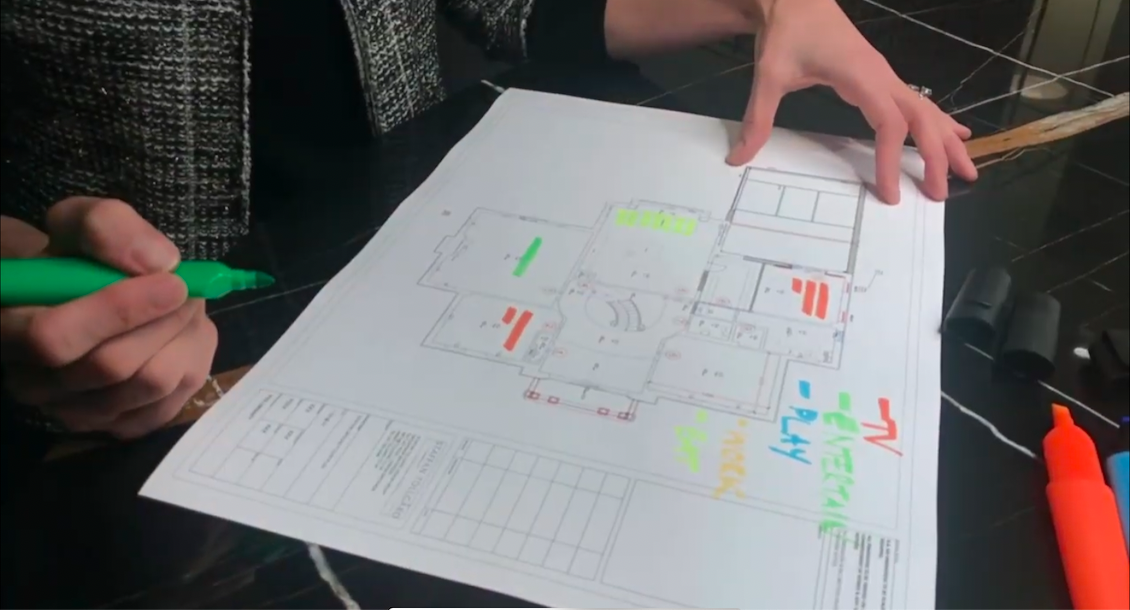
We embarked on a heat mapping exercise of the house, using very 101 tools … different coloured highlighters and a few plans of the house to show the different use patterns of the house from week days to weekends.
This interiors exercise is a simple one:
Break the day down into chunks.
Understand the main things you do everyday and give them a colour.
For this young family we used TV, ENTERTAINMENT, PLAY, WORK, EAT.
I would also want to be adding things like EXERCISE, RELAX, HOBBIES, GARDEN.
Look at the plan of the house & then give each function a stripe each time you perform an activity in a particular room.
At the end of the day, and at the end of a weekend day, add up the activities per room & analyse which of the spaces are hot (over used) & which are cold (underused).

From this exercise you quickly start to see the possibilities of how the house can be used more equally. We so often see that the dining room & guest bedrooms are given the best geography in the house; but only used very occasionally. A home office is crammed into eaves of the roof, or hidden away downstairs when we know that more & more of us are going to work from home. There are so many options for hidden-away desk solutions that can be combined into the guest bedroom or dining room to even out the heat map.
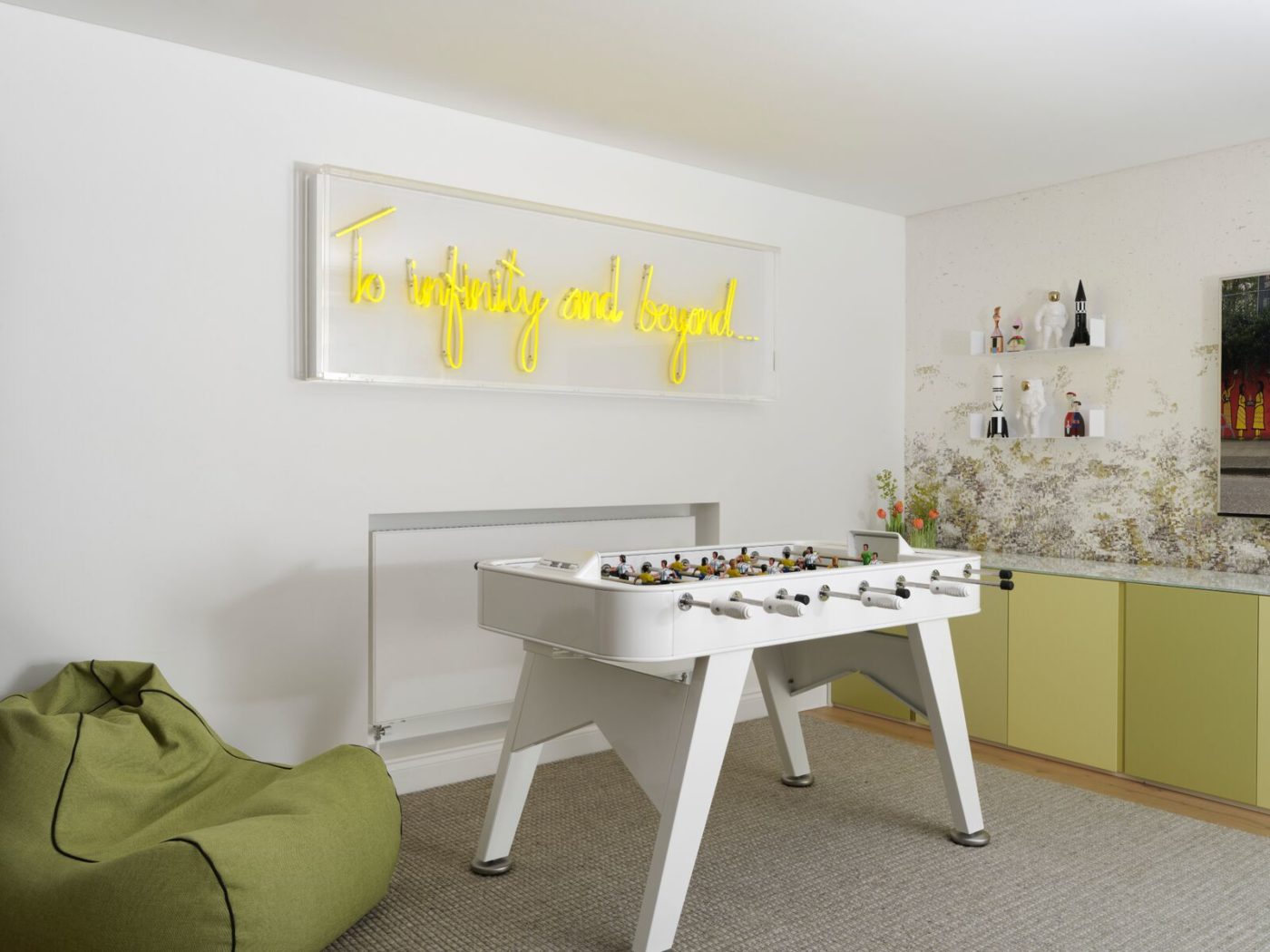
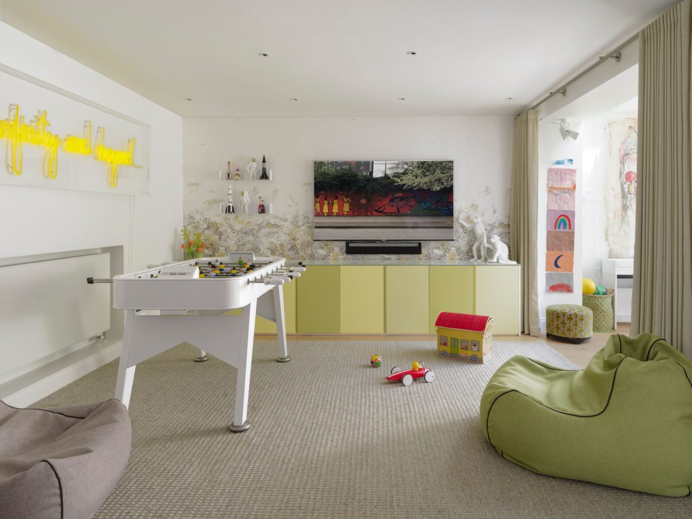
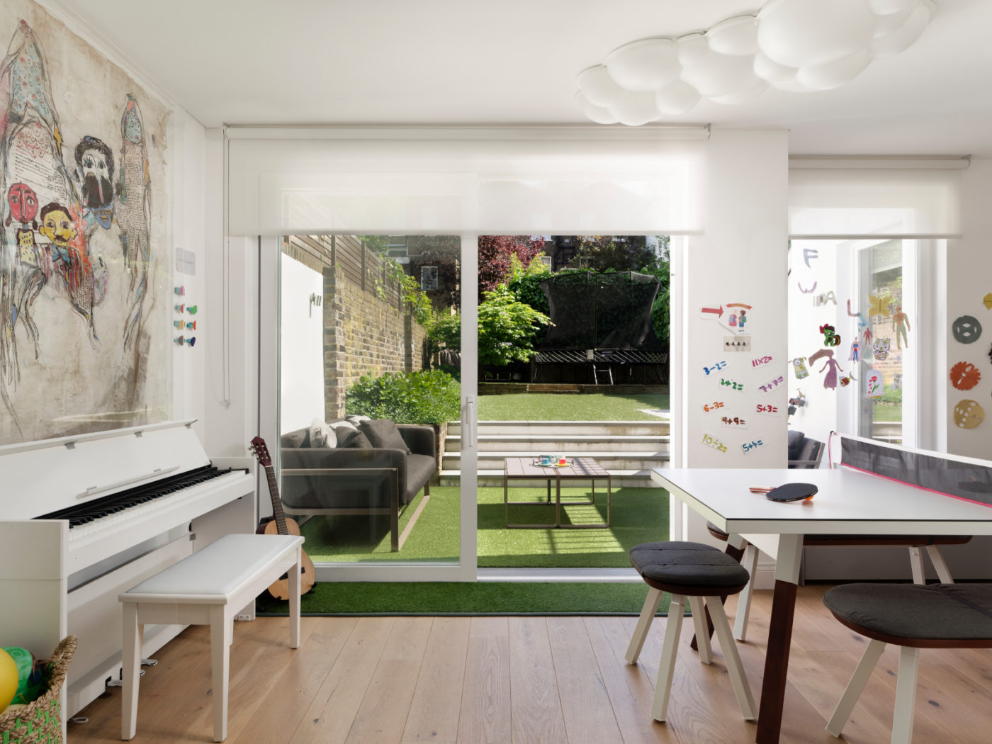
With my family and their unloved raised-ground floor interiors we ended up taking the main TV and the home office away from the kitchen area and moving these activities (or possibilities of) upstairs. We made the dining room the centre of the space with a child-friendly dining table top that could withstand daily use & abuse. And a lovely play room that opened up onto the garden. And that was it. No more functionality crammed onto that floor.
Click here to view entire project
When I visited the house a year after we worked on it I saw the results of our changes. My client was playing with her new little baby upstairs, making the most of the light-filled room while her other child played downstairs just before lunch. The changes to the raised ground floor with its living room and home study had evened out the way they used the different floors. The living room was beautiful but not too formal for everyday use. We had changed the heat map – and changed the way the family enjoyed every inch of the house.
To view some of our other blog posts choose one from below:


